Statistics 2. Distributions
Originally published in Kaggle
Introduction
A distribution of data is a representation (or function) showing all possible values (or intervals) and how often those values occur.
For categorical data, we'll often see percentage or exact number for each of the category.
For numerical data, we'll see the data split into appropriate sized buckets ordered from smallest to largest
When a distribution is plotted into a graph, we can observe different shapes of the curve. Based on the shape and other attributes, there exists many types of distributions. A few statistical distributions are,
- Bernoulli Distribution
- Binomial Distribution
- Cumulative frequency distribution
- Bimodal distribution
- Gaussian distribution (Normal distribution)
- Uniform distribution
Let's setup our dataset,
import math
import numpy as np
import pandas as pd
from matplotlib import pyplot
from scipy import stats

matches    = pd.read_csv('../input/matches.csv')
deliveries = pd.read_csv('../input/deliveries.csv')
Cumulative relative frequency graph
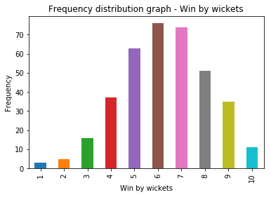
Let's take win_by_wickets dataset and plot a frequency distribution graph.
X-axis - Win by wickets (value from 1 to 10), Y-axis - Number of instances (or frequency) of win-by-wicket margin
win_by_wickets_data = matches[matches.win_by_wickets > 0].win_by_wickets
win_by_wickets_freq = win_by_wickets_data.value_counts(sort=False)
print(win_by_wickets_freq)
plt = win_by_wickets_freq.plot.bar()
plt.set_title("Frequency distribution graph - Win by wickets")
plt.set_xlabel("Win by wickets")
plt.set_ylabel("Frequency")
1      3
2      5
3     16
4     37
5     63
6     76
7     74
8     51
9     35
10    11
Name: win_by_wickets, dtype: int64


Text(0,0.5,'Frequency')
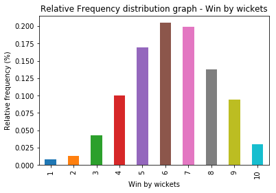
Now, let's plot Relative frequency distribution graph for the same data. Here in Y-axis, instead of showing the frequency, we show the percentage of the value. We can use normalize = True argument for pandas.Series.value_counts method
win_by_wickets_rel_freq = win_by_wickets_data.value_counts(sort = False, normalize = True)
print(win_by_wickets_rel_freq)
plt = win_by_wickets_rel_freq.plot.bar()
plt.set_title("Relative Frequency distribution graph - Win by wickets")
plt.set_xlabel("Win by wickets")
plt.set_ylabel("Relative frequency (%)")
1     0.008086
2     0.013477
3     0.043127
4     0.099730
5     0.169811
6     0.204852
7     0.199461
8     0.137466
9     0.094340
10    0.029650
Name: win_by_wickets, dtype: float64


Text(0,0.5,'Relative frequency (%)')
From here, we can plot the cumulative relative frequency graph using pandas.Series.cumsum .
win_by_wickets_cumulative_freq = win_by_wickets_data.value_counts(sort = False, normalize = True).cumsum()
print(win_by_wickets_cumulative_freq)
plt = win_by_wickets_cumulative_freq.plot.bar()
plt.set_title("Cumulative relative frequency distribution graph - Win by wickets")
plt.set_xlabel("Win by wickets")
plt.set_ylabel("Cumulative relative frequency (%)")
1     0.008086
2     0.021563
3     0.064690
4     0.164420
5     0.334232
6     0.539084
7     0.738544
8     0.876011
9     0.970350
10    1.000000
Name: win_by_wickets, dtype: float64


Text(0,0.5,'Cumulative relative frequency (%)')
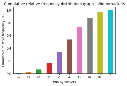
What's the relevance of this representation?
Let's try to answer this → What is the probability of winning a match by 6 wickets or less?.
Of course we can calculate that using the data. But let's try to figure out from the graph. Draw a line from the top of "6" to the Y-axis. We'll draw Line graph instead of Bar graph.
plt = win_by_wickets_cumulative_freq.plot.line()
plt.axhline(y = win_by_wickets_cumulative_freq[6], xmax = 5.5/10, linestyle='dashed')
plt.axvline(x = 6, ymax = win_by_wickets_cumulative_freq[6], linestyle='dashed')
<matplotlib.lines.Line2D at 0x7fd2eff50278>
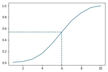
We can roughly approximate this value to be around 0.54.
Thus, using cumulative relative frequency graph, the probability of winning a match by 6 wickets or less is approximately 54%.
We can also calculate the percentile of a value using the above graph. For example, if a team wins by a margin of 4 wickets, the percentile of this match is around 16%
Normal distribution
Normal distribution is a continuous probability distribution that describes many natural datasets. It is also known as bell curve or Gaussian distribution. We see many natural examples that are closer to a normal distribution.
- Heights of people
- Shoe sizes
- Lap duration in a car race
In a perfect normal distribution, we can see 50% symmetry about the center. Also, the center is - mean = mode = median.

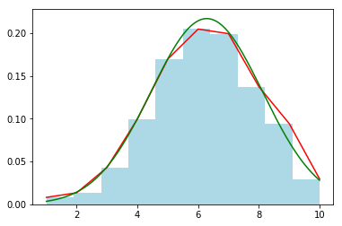
Normal distribution and variance
If the variance of the dataset is high, the curve tends to look flat. If variance is low, curve is more steeper.

Let's plot win_by_wickets data and watch the curve.
# Get mean (mu) and std (sigma)
win_by_wickets_mean, win_by_wickets_std = win_by_wickets_data.mean(), win_by_wickets_data.std()

# Plot histogram (normalized) - LIGHT-BLUE
win_by_wickets_data.hist(color='lightblue', weights = np.zeros_like(win_by_wickets_data) + 1.0 / win_by_wickets_data.count())

# Plot line graph - RED
win_by_wickets_data.value_counts(sort=False, normalize=True).plot.line(color='red')

# Normal distribution for random points between 1 to 10 with mean, std.
random_data = np.arange(1, 10, 0.001)
pyplot.plot(random_data, stats.norm.pdf(random_data, win_by_wickets_mean, win_by_wickets_std), color='green')
[<matplotlib.lines.Line2D at 0x7fd2efea2e80>]
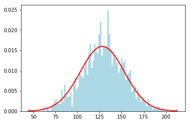
Plotting the probability density function (PDF)
A Probability distribution function (PDF) is a function associated with continuous random variable which desribes the relative probability of the random variable at a given value.
The probability density function of the normal distribution for a given point (x), mean () and standard deviation () is given by,
Let's plot a PDF for some random values (Source: numpy.random.normal)
mu, sigma = 128, 25 # From the above example
highest_scores = np.random.normal(mu, sigma, 1000) # Random 1000 values

count, bins, _ = pyplot.hist(highest_scores, 100, normed = True, color='lightblue') # plot 100 points
pyplot.plot(bins, 1/(sigma * np.sqrt(2 * np.pi)) *
    np.exp( - (bins - mu)**2 / (2 * sigma**2) ),
    linewidth = 2, color = 'r') # Plot the PDF
/opt/conda/lib/python3.6/site-packages/matplotlib/axes/_axes.py:6571: UserWarning: The 'normed' kwarg is deprecated, and has been replaced by the 'density' kwarg.
  warnings.warn("The 'normed' kwarg is deprecated, and has been "


[<matplotlib.lines.Line2D at 0x7fd2eee18470>]
Z-Score
A Z-score measures how many standard deviations above or below the mean a data point is. It is calculated as,
- Positive Z-score → Data point is above the mean
- Negative Z-score → Data point is below the mean
- Close to zero → Data point is close to the mean
Example: If a team wins by a margin of 35 runs, what's the z-score? Let's calculate
win_by_runs_data = matches[matches.win_by_runs > 0].win_by_runs
win_by_runs_mean, win_by_runs_std = win_by_runs_data.mean(), win_by_runs_data.std()
z_score_35 = (35 - win_by_runs_mean) / win_by_runs_std
print(f'Z-score of 35 is {z_score_35:.2f}')
Z-score of 35 is 0.19
We can convert from z-score to percentile using a Z-table or scipy.stats.norm.cdf function.

z_score = stats.norm.cdf(0.19)
print(f'z-score of 0.19 = {z_score * 100:.2f} percentile')
z-score of 0.19 = 57.53 percentile
Probability distribution function in terms of z-score (z) given by,
Empirical rule (68–95–99.7 rule)
Empirical rule also called 68-95-99.7 or three sigma rule gives an approximate of values within 1,2 or 3 standard deviations from the mean. The following diagrams represents the value distribution from the mean in a normal distribution.


Binomial distribution
Binomial experiment
A Binomial experiment has the following properties.
- Consists of fixed number of trials (n)
- Trials are independent of each other
- Each trial can be either success or failure
- Probability of success (P) on each trial remains the same
Example: Number of heads in after flipping a coin 10 times
- The experiment is conducted for fixed number of trials - 10
- Probability of getting head in one trial does not affect the other
- Probability of getting head in any trial remains same - 0.5 (in a non-biased coin)
Binomial variable
A binomial variable is the number of successes (x) out of all the trials (n).
What is the probability of getting 5 heads after flipping a coin 10 times? Here is a binomial variable.
Binomial distribution
The probability distribution of a binomial variable is called Binomial distribution.
Let's take the problem statement of flipping a coin - Probability of getting 5 heads after 10 flips? P(X = 5) can be calculated as
For 10 flips, we have a total of outcomes. Hence,
No. of outcomes where exactly 5 heads occur out of 10 flips =
Deriving General Binomial Probability equation
Let's take the example of a biased coin instead of a fair coin with 60% chance of heads and 40% chance of tails.
What is the probability of getting 2 heads out of 3 tosses?
(Probability of getting heads)
(no. of success i.e. heads)
(no. of trials)
No. of outcomes we want = (HHT, HTH, THH)
To calculate probability of each outcome, let's take one outcome- HHT
- Probability of getting H in trial 1 = 0.6
- Probability of getting H in trial 2 = 0.6
- Probability of getting T in trial 3 = 0.4
Hence, probability of getting HHT =
i.e.
Finally,
Probability of getting 2 heads out of 3 =
Putting it together,
Hence, the general binomial probability equation is,
Also,
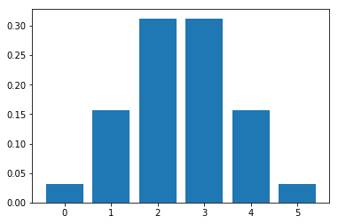
Plotting Binomial Distribution
Let be a random variable = No. of heads from flipping a coin 5 times
def compute_binomial_probability(x, n, p):
    """Returns the probability of getting `x` success outcomes in `n` trials,
    probability of getting success being `p`

    Arguments:

    x - number of trials of the event
    n - number of trials
    p - probability of the event

    """
    outcomes = math.factorial(n) / (math.factorial(x) * math.factorial(n - x))
    probability_of_each_outcome = p ** x * (1 - p) ** (n - x)
    return outcomes * probability_of_each_outcome

def plot_binomial_distribution_graph(n, p):
    """Plots Binomial distribution graph of an event with `n` trials,
    probability of getting success of the event being `p` for values `0` to `n`

    Arguments:

    n - number of trials
    p - probability of the event

    """
    probabilities = list(map(lambda x: compute_binomial_probability(x, n, p), range(0, n+1)))
    pyplot.bar(list(range(0, n+1)), probabilities)

plot_binomial_distribution_graph(5, 0.5)
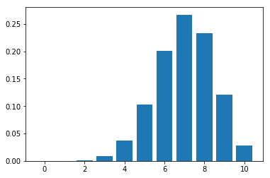
Let's plot the distribution for flipping a coin 10 times.
plot_binomial_distribution_graph(10, 0.5)

As we can observe, with more trials, the plot tends to look like Normal distribution
Plotting the graph for a biased coin -
plot_binomial_distribution_graph(10, 0.7)
Bernoulli distribution
Bernoulli distribution is a discrete probability distribution of a random variable which has only two outcomes ("success" or a "failure"). It is named after Swiss mathematician Jacon Bernoulli. It is a special case of Binomial distribution for n = 1.
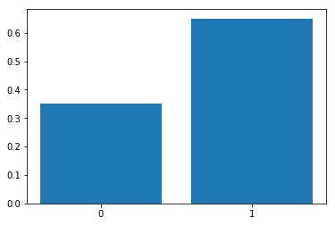
For example, probability (p) of scoring a goal in last 10 minutes is 0.35 (success), probability of not scoring a goal in last 10 minutes (failure) is 1 - p = 0.65.
Plotting Bernoulli distribution with probability for p = 0.65,
pyplot.bar(['0', '1'], [0.35, 0.65])
<BarContainer object of 2 artists>