Statistics 3. Bivariate data
Originally published in Kaggle
Introduction
Bivariate numerical data involves two variables in a dataset. Relationship between two variables can be visualized using a scatter plot and measured using a metric called correlation coefficient.
Let's setup our environment.
import numpy as np
import pandas as pd
from matplotlib import pyplot
import math

matches = pd.read_csv('../input/matches.csv')
deliveries = pd.read_csv('../input/deliveries.csv')
Scatter plot
Scatter plots help us see relationship between variables. We can infer by looking at the plot, whether there is a positive or negative or no association between the variables. Following is a sample scatter plot between Variable A and Variable B.

We can see that there is a positive association between Variable A and Variable B. i.e. Variable A increases as variable B increases.
Some datasets many contain a few data points that doesn't fit the pattern. They're called outliers.

Correlation
Positive correlation
A positive correlation exists between two variables A and B when A increases, B also increases and B decreases when A decreases. Graph between A and B would look like the following.

Examples
- Height v/s Weight of a person
- Walking distance v/s calories burnt
- Product quality v/s sales
Perfect Positive correlation
A perfect positive correlation exists if there is a positive linear association between two variables. Which means, given variable A, we can exactly predict the value of B by multiplying with a positive number.

Examples
- Length of a square v/s it’s circumference
- Weight in kilos v/s weight in pounds
Negative correlation
A negative correlation exists between two variables A and B, if A decreases when B increases and A increases when B decreases.

Examples
- Mobile screen time v/s remaining battery percentage
- Current run rate v/s Required run rate (in Cricket)
Perfect Negative correlation
A perfect negative correlation exists if there is a negative linear association between two variables.

Examples
- Power v/s focal length of a lens
- Frequency v/s wavelength of light
Zero correlation
If two variables are independent of each other, then there is no correlation or zero correlation.

Examples
- Bitcoin price v/s speed of light
- Your mobile usage per day v/s neighbor’s electricity bill
Correlation coefficient
Correlation coefficient measures the linear correlation between variables.
- Value is between -1 to +1
- Value closer to 1 → Strong positive linear relationship
- Value closer to -1 → Strong negative linear relationship
- Value cloesr to 0 → weak relationship
Formula for calculating correlation coefficient between and is given by,
In terms of z-score,
Let's draw a scatter plot between X = Total runs scored and Y = highest score by a batsman in an innings
highest_score_batsman = deliveries.groupby(['match_id', 'batting_team', 'batsman']) \
                                  .batsman_runs \
                                  .agg([np.sum]) \
                                  .max(level = ['match_id', 'batting_team'])

total_runs = deliveries.groupby(['match_id', 'batting_team']) \
                       .total_runs \
                       .agg([np.sum])

match_total_highest_combined = pd.concat([highest_score_batsman, total_runs], axis=1)
match_total_highest_combined_list = []
for name in match_total_highest_combined.index:
    match_total_highest_combined_list.append({
        "highest": match_total_highest_combined.loc[name].tolist()[0],
        "total": match_total_highest_combined.loc[name].tolist()[1]
    })

total_highest_df = pd.DataFrame.from_records(match_total_highest_combined_list)
pyplot.scatter(total_highest_df.highest, total_highest_df.total)
pyplot.xlabel("Highest runs by a batsman")
pyplot.ylabel("Total runs scored by the team")
pyplot.show()
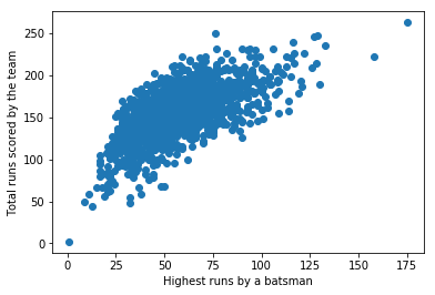
Let's calculate the correlation coefficient between X and Y.
# Use `.corr` method
corr = total_highest_df.highest.corr(total_highest_df.total)
print(f'Correlation between "Highest runs by a batsman" and "Total runs scored by the team" is {corr}')
Correlation between "Highest runs by a batsman" and "Total runs scored by the team" is 0.6580911324218256
We get a correlation coefficient of 0.658. As we can observe from the graph and infer from the number, there's a positive correlation.
Covariance
Covariance is another measure of joint variability between two random variables. It is calculated as,
Correlation in terms of covariance is given by,
# Use `.cov` method
cov = total_highest_df.highest.cov(total_highest_df.total)
print(f'Covariance between "Highest runs by a batsman" and "Total runs scored by the team" is {cov}')
Covariance between "Highest runs by a batsman" and "Total runs scored by the team" is 440.21403525128056
We can verify the same using the above formula.
corr * total_highest_df.highest.std() * total_highest_df.total.std()
440.2140352512808
Least squares regression
We can fit an approximate line for the scatter plot by a method called least squares regression. This can be helful in predicting unknown values.
A line is represented by the equation .
Formula for the slope, is given by,
The line would go through the coordinates . Hence substituting and gives us the value for .
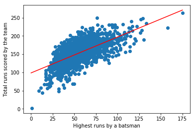
Let's find out the equation for the best-fit line for our scatter plot.
# Step 1: Find slope
m = corr * total_highest_df.total.std() / total_highest_df.highest.std()
print(f'Slope, m = {m}')

# Step 2: Find (x_bar, y_bar)
x_bar, y_bar = total_highest_df.highest.mean(), total_highest_df.total.mean()
print(f'(x_bar, y_bar) = ({x_bar}, {y_bar})')

# Step 3: Find intercept
b = y_bar - m * x_bar
print(f'Intercept, b = {b}')

# Equation of the line
print(f'Equation of the line is y = {m:.2f}x + {b:.2f}')
Slope, m = 0.985074463842775
(x_bar, y_bar) = (56.96115107913669, 154.69064748201438)
Intercept, b = 98.5796721228665
Equation of the line is y = 0.99x + 98.58
Let's plot the line along with the scatter plot
pyplot.scatter(total_highest_df.highest, total_highest_df.total)
pyplot.xlabel("Highest runs by a batsman")
pyplot.ylabel("Total runs scored by the team")

# Two points (x1, y1), (x2, y2) that follows the eqn y = mx + b
(x1, y1), (x2, y2) = (0, b), (175, 175*m + b)
pyplot.plot([x1, x2], [y1, y2], 'r-')
pyplot.show()
Coefficient of determination (R-squared)
Coefficient of determination or R-squared is a measure of how close the data are fitted in the regression line. It is calculated as the square of correlation coefficient (r)
r_squared = corr * corr
print(f'R-squared = {r_squared:.2f}')
R-squared = 0.43
i.e. we have a variability of 43% in our best-fit line
Root mean square error (RMSE)
Residuals are a measure of how far from the regression line data points are. Root mean square error (RMSE) is the standard deviation of the residuals. It is given by,
In terms of R-squared,
rmse = math.sqrt(1 - r_squared) * total_highest_df.total.std()
print(f'Root mean square error = {rmse}')
Root mean square error = 23.825378828608915
While RMSE is an absolute measure, R-squared is a relative measure (value between 0 to 1).